
Accessible Text and Math
Majority of the content in an online course site is text. Text is the most accessible format to present information: it can be read by all users and software without concerns about image descriptions or captions. But that doesn’t mean that accessible text just happens by default! There are considerations that need to go into writing and formatting an accessible web page or document. For mathematical equations or scientific formulas, there are some additional requirements for accessibility that are addressed here as well.
Who Needs Accessible Text?
Accessible text benefits all students with “print disabilities,” which is a term that refers to a wide variety of disabilities that interfere with a person’s ability to read text. This can range from blindness or low vision to attention disorders or dyslexia. The strategies outlined here help all of these students fully access the text. And many of the formatting recommendations are beneficial to all students and create an easier reading experience for anyone in the course. Accessible design is good design!
Accessible Documents
Many of these strategies apply to accessible documents as well. The Microsoft Office Suite comes with a robust, built-in automated accessibility checker, which can help you verify the accessibility of a document. For PDFs, Northwestern utilizes SensusAccess, a tool that can quickly and automatically make your PDF more accessible. Northwestern’s accessibility hub also has numerous trainings on document accessibility, especially through LinkedIn Learning.
Formatting
There are several considerations to keep in mind when formatting an accessible web page or document. The good news is that support for all of these considerations is built into Canvas and most word processing programs! You don’t have to know how to code to format accessible text.
Headings
Headings break up text into manageable chunks and help students find relevant information quickly. Whether using a screen reader to jump from heading to heading or visually skimming over a page, headings are like signposts in your text, guiding students to the pieces they need.
The most important thing to remember with headings is that they must be used in appropriate, descending order. The first heading is Heading 1, any subheads under that are Heading 2, any subheads under that are Heading 3, and so on. Think of headings like a bulleted list: you should be able to lift them out of the page and have an outline of your content. For example:
- Accessible Text and Math (Heading 1)
- Who Needs Accessible Text? (Heading 2)
- Formatting (Heading 2)
- Headings (Heading 3)
- Links (Heading 3)
- Lists (Heading 3)
- White Space (Heading 3)
- Writing and Math (Heading 2)
In Canvas, the page title is always Heading 1, so the first heading you should use when adding text in the Rich Text Editor is Heading 2. In Microsoft Word, you can use the Styles ribbon to add headings to your content. In Google Docs, the dropdown menu that defaults to “Normal text” is where you find the heading options.
Headings should also be unique and informative, giving students an idea of what content follows the heading. As you can see from the example above, that doesn’t mean they have to be lengthy! They just need to give students some context for what the heading’s section is all about.
Links
In online courses, it’s easy–and encouraged–to provide links within instructional materials so that students can immediately go to the web site, article, or video being discussed. However, when providing links, it’s important to make sure that the text of the link is descriptive and unique. Students who use screen readers can, on a properly formatted web page, jump from link to link in order to skim a page and get a sense of the content, navigation, and structure. However, if all the links on a page say “click here,” then very little information is provided.
For similar reasons, providing the full URL of a website is not advisable. Screen readers will read out the entirety of a URL, and being forced to listen to “h t t p colon backslash backslash d l period s p s period northwestern period e d u” for every URL gets very tiresome very quickly. Instead, it is much better to direct people to the SPS Distance Learning website, for example, by embedding the link in the text.
In addition, if a link will open a new window or download a document, make sure to note that in the link. Canvas does this automatically for new web pages: you might notice that in the rich text editor, there will be a parenthetical next to the link that says (Link opens in an external window). That text doesn’t appear on the actual page, but it will be read out to screen readers or text-to-speech users. However, if a link leads to a document download, be sure to include that information so users know exactly what will happen when they click the link.
Lists
Lists should be formatted using the appropriate styles in Canvas or a word processor. This means that lists should look like this:
- Example One
- Example Two
And not this:
* Example One
* Example Two
By using appropriate styles, screen readers and other text-to-speech software can identify that something is a list and announce it to the listener, so they know that the next group of items is connected. Canvas and word processing programs all provide numerous options for formatting, so whether you want bullet points, Roman numerals, or letters, you can set up your list however you want.
White Space (and Headings Again)
Lengthy blocks of text can be tiring for anyone to read, but they present additional challenges for print disabled people. A user with ADHD, for example, might struggle to find their place again when their attention wanders from a large, unbroken wall of text.
By using headings and white space, which is simply breaking up paragraphs into smaller chunks with an empty line between, a lengthy page of text can become much easier to read. If a student loses their place, they can either find the right heading or skim the start of each paragraph until they get back to where they were, instead of having to re-read the same lengthy block of text multiple times.
Writing and Math
Just as there are ways to format text to make it more accessible, there are also considerations for how to write text to make it more accessible as well. The guidelines here for accessible writing and math apply more to how students using assistive technology will interact with the text. For information on how to write content that is accessible and inclusive, visit the pages on Accessible Teaching Practices and Inclusive Course Content.
Unique and Descriptive Page Titles
Just as embedded URLs should have unique and descriptive text, page titles in Canvas should follow the same principles. Students who are looking for a specific page will be able to find it much faster and easier if the page title clearly states what it is.
For example, something like “Module 2 Quiz: Data Visualization Terms” is much better than “Quiz 2.”
Avoid Abbreviations
Jan 2, X vs Y, Ch. 8, and so on--these are all fairly common abbreviations seen in course sites. But for students using screen readers, they may not be clear. Instead, for items like these, write out the full words: January 2, X versus Y, and Chapter 8.
If there are abbreviations or acronyms commonly used in your field, provide the full term first, followed by the shortened version in parentheses, which you can then use going forward. For example: “The School of Professional Studies (SPS) offers online degree programs for adult and continuing learners. At SPS, we believe…”
Text-Based Instructions
When giving students instructions on how to complete a task, make sure that they can be understood only through text. Instructions should not rely on location, color, or sound to complete.
What does that mean? It means that students should be directed to the main course navigation, rather than the left-hand navigation. Or that if information about a task is provided via audio, there should be a text transcript. Or if key terms are highlighted in red, they should be accompanied by other indicators like the strong tags (which make text bold). Students who cannot see the screen can’t tell where the left-hand navigation is; students who can’t hear the audio won’t know what to do if there isn’t a text version.
You can use color, sound, and other multimedia information as part of your instructions! But you need to make sure that they aren’t the only way to access the information.
Accessible Math
Mathematical equations and scientific formulas are a crucial part of education for many students. However, the symbols in these equations can present a challenge for screen reader software and other assistive technology. The best way to make equations and formulas accessible is to write alt text for them. Penn State University and Instructure have brief guides on how to do this.
It’s important to note that at present, the equation editors present in Microsoft Word and Canvas do not produce accessible outputs. The equation editor in Word is not compatible with a majority of screen readers; Canvas uses the LaTeX editor, which does generate its own alt text. Unfortunately, this alt text is in a specialized LaTeX format, which isn’t useful to students who aren’t already deeply familiar with it. With the resources currently available, alt text is the best option for accessible math.
Examples
To help illustrate these concepts, here are a few examples of excellently written mathematical alt text. They are all taken from MATH 220B with the permission of the instructor, Professor Amy Alznauer.
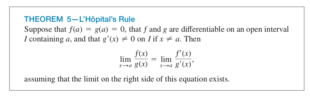
Alt Text: Suppose that f of a equals g of a equals 0, that f and g are differentiable on the open interval I containing a, and that g prime of x does not equal 0 on I if z does not equal a. The limit as x goes to a of f of x over g of x is equal to the limit as x goes to a of f prime of x over g prime of x, assuming that the limit on the right side of this equation exists.
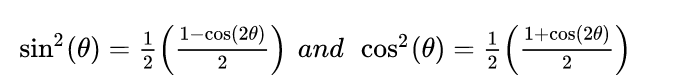
Alt Text: sine squared is equal to one half times the quantity (1 minus cosine of 2 theta) over 2. cosine squared is equal to one half times the quantity (1 plus cosine of 2 theta) over 2.
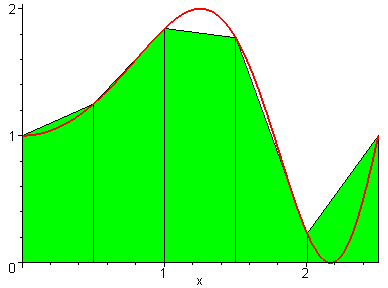
Alt Text: This animated gif shows trapezoids filling in the space under a graph. It starts out with just a few trapezoids connecting points on the graph, and then increases to more and more and more trapezoids, until it looks like the area under this curve’s graph is perfectly filled in.
Accessible Data Tables
Data tables are a great way to convey information to students, and with a few simple steps, they can be highly accessible. There are also a few considerations to keep in mind with tables.
- Do not use tables as a way of organizing information on a page. Screen readers and other text-to-speech tools assume that all tables contain data; using them for layout or design creates confusion.
- Avoid blank cells as much as possible. Screen readers will read each blank aloud, and that can be an unpleasant listening experience!
- Similarly, avoid merged cells. A few here and there, especially in header cells, are okay, but numerous merged cells makes the table very difficult to navigate (and may be a sign that the data may need to be presented in a different way).
Accessible Tables in Canvas
After creating a data table in Canvas, follow these steps to ensure it’s accessible.
In the Rich Text Editor, determine which cells in the table are the header cells and what their scope is. These are typically the top row or far left column, but depending on the complexity of the table they may be elsewhere. Header cells provide information about the category of the information that falls under them: Grade, Due Date, Assignment Type, etc.
The scope refers to the cells that the header cell “controls.” For header cells in the top row, the scope is typically the single column underneath them; likewise, for header cells on the left column, their scope is typically the row that they begin. If your header cell is merged across multiple columns or rows, the scope is either a column group or row group.
Next, create a header cell and apply the correct scope attribute.
- Click on the cell you want to make into a header cell. You can also highlight a whole row or column.
- Click on the Table menu, then select Cell, then Cell Properties from the dropdown menus.
- Under Cell Type, select Header Cell.
- Under Scope, select the appropriate scope. In most tables, this will just be Column.
- Click OK.
Repeat these steps for all header cells in the table.
Accessible Tables in Microsoft Word
After creating a table in Word, click on the Table Design tab. This will open a new ribbon with a variety of options. The first set of options (on the far left of the ribbon) includes a Header Row checkbox. Make sure this is checked, and the first row will be designated as the header. It is also recommended to make some visual changes to the first row, such as using bold font and a different color background, to make sure it stands out.