
Campton — Headline Use Only


Stay Classy SPS
The SPS graphic identity is the visual representation of the SPS brand. The objective of the SPS graphic identity is to present SPS in a consistent and professional manner that reinforces our position as a part of Northwestern University and that also is well-suited to our audience of working professionals who are pursuing higher education in order to advance their careers. The graphic identity consists of the SPS logo, color, typography and visual style.
The graphics in this guide are registered trademarks and should only be used as detailed here. The graphic system represents the identity of Northwestern University and should not be diluted through substitution or revision, or altered in any way.
For additional details, visit the University Global Marketing Department's Visual Identity web pages.
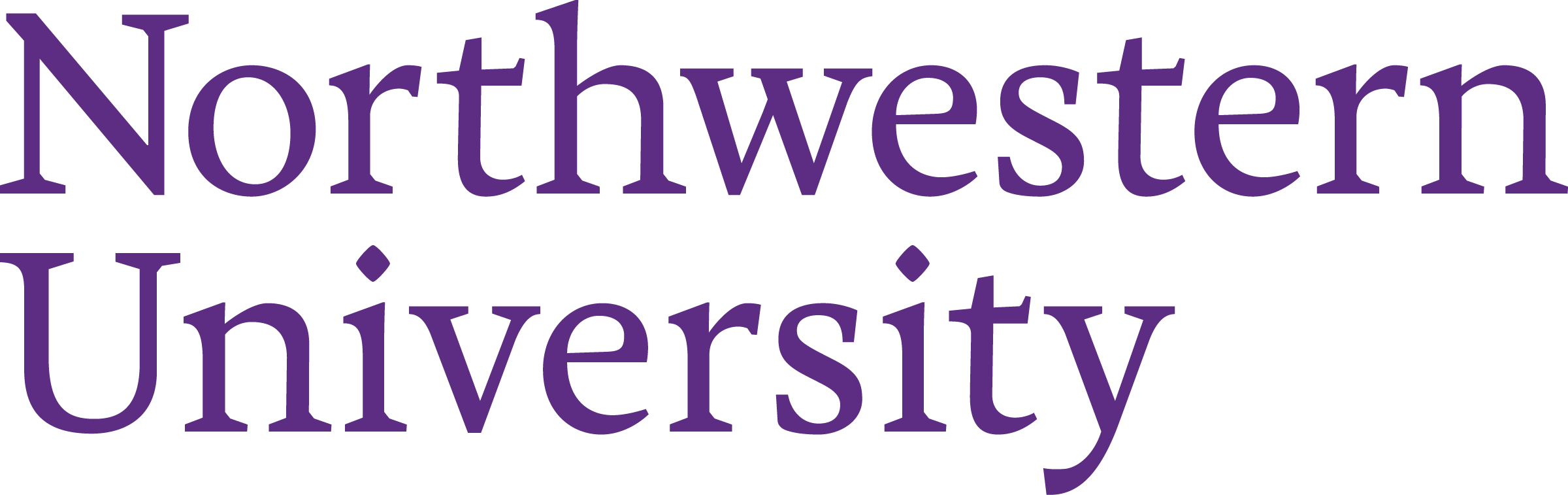
Our wordmark is the primary identifier for the University, relating all entities within our institution. It’s a symbol of what we stand for, and should be treated with respect.
By freeing the wordmark from the University seal, we have more flexibility in using our name. Although there are three versions of our wordmark, in most cases, our heritage and reputation allow the Northwestern name to stand on its own. This is the preferred version of our wordmark. In most cases, our reputation precedes us and the word “University” is not needed.
![]()
Sometimes we need to be more specific. Use these wordmarks when our audience may not be familiar with Northwestern as an institution, such as in international advertising or admissions materials. This lockup can be used in either a stacked or horizontal configuration. Use the version that is most appropriate.
![]()
DOWNLOAD NORTHWESTERN WORDMARKS
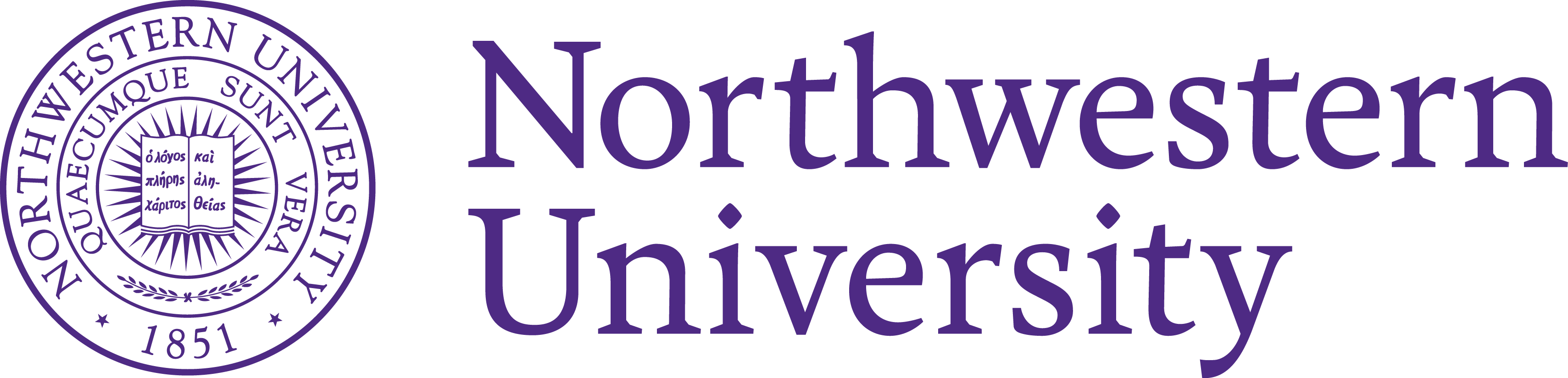
In the formal lockup, the wordmark is paired with the official University seal. By reserving the seal for formal, high-profile, and sophisticated communications, we can elevate it to a place of honor and importance. The seal is best reserved for instances such as diplomas, commencement and convocation, formal events, and engravings and architectural etchings.
The formal lockup can be used in either a stacked or horizontal configuration. Use the version most appropriate for the format at hand.
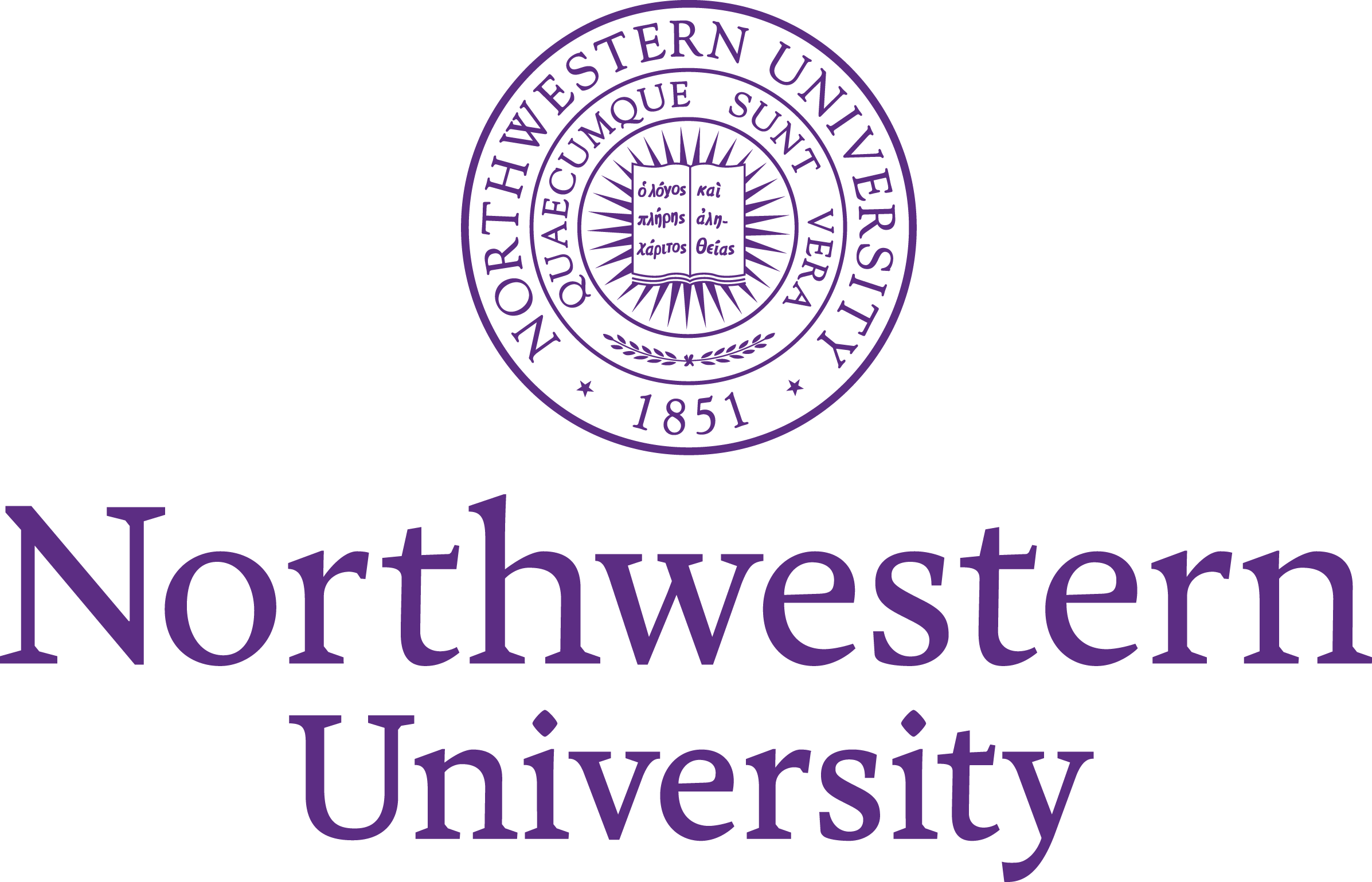
The formal lockup is only available upon request. Please contact Erin Phipps with any inquiries.
The lockup system is used University-wide and is based on a simple idea: choose the most essential part of an organization’s name and make it the most prominent element in the lockup. This allows complex information to be communicated within a simple hierarchy. In horizontal lockups, this essential element appears on a primary line; in vertical lockups, it’s set in heavier type. In certain cases, type scale is used to create the correct hierarchy within the lockup.
Horizontal Basic Lockup
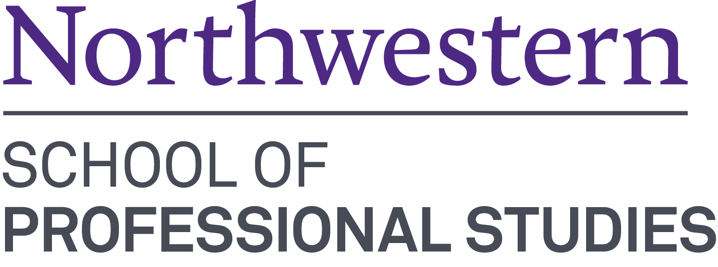
The SPS horizontal basic lockup use ones primary line, with secondary line above the primary.

Vertical Basic Lockup
Vertical lockups are constructed using the same grid as their horizontal counterparts.
![]()
Horizontal Shorthand Lockup
Shorthand lockups are simplified constructions that use only the Northwestern wordmark and primary line text. The shorthand lockup uses the primary line from the horizontal lockup without the secondary line above. Use this lockup in informal applications or when space constraints create readability problems for secondary lines.
![]()
Vertical Shorthand Lockup
Use these lockups in informal applications, when space constraints create readability problems for secondary lines, or as part of a shorthand combination lockup.

Northwestern Purple
Uncoated Stock CMYK: 84, 100, 0, 0
Uncoated Stock Pantone: Dark Blue 35.5, Rhodamine 36.5, Black 3, TRANS. WT. 25
Coated Stock CMYK: 85, 100, 0, 15
Coated Stock Pantone: Process Blue 37, Rubine Red 61, Black 2
RGB: 078, 042, 132
HEX: #4E2A84
For additional information, including secondary colors, tints, and web colors, visit the University Global Marketing Department's Color web pages.

Files and templates for SPS staff. The are copyrighted materials. The Northwestern University logo is a registered trademark of Northwestern University.
SPS logo step and repeat large
SPS logo step and repeat small
SEE ALL NORTHWESTERN ZOOM BACKGROUNDS
Please refer to the Northwestern usage guidelines before downloading any files.
To download any file, right-click (PC) or control-click (Mac).
![]()

For print use (eps files)
For web use (jpeg file)
For MS Office (bmp files)
